
/
Bitex
Bitex : A Web3 Wallet
Role
UX/UI Designer
Timeline
2 Weeks
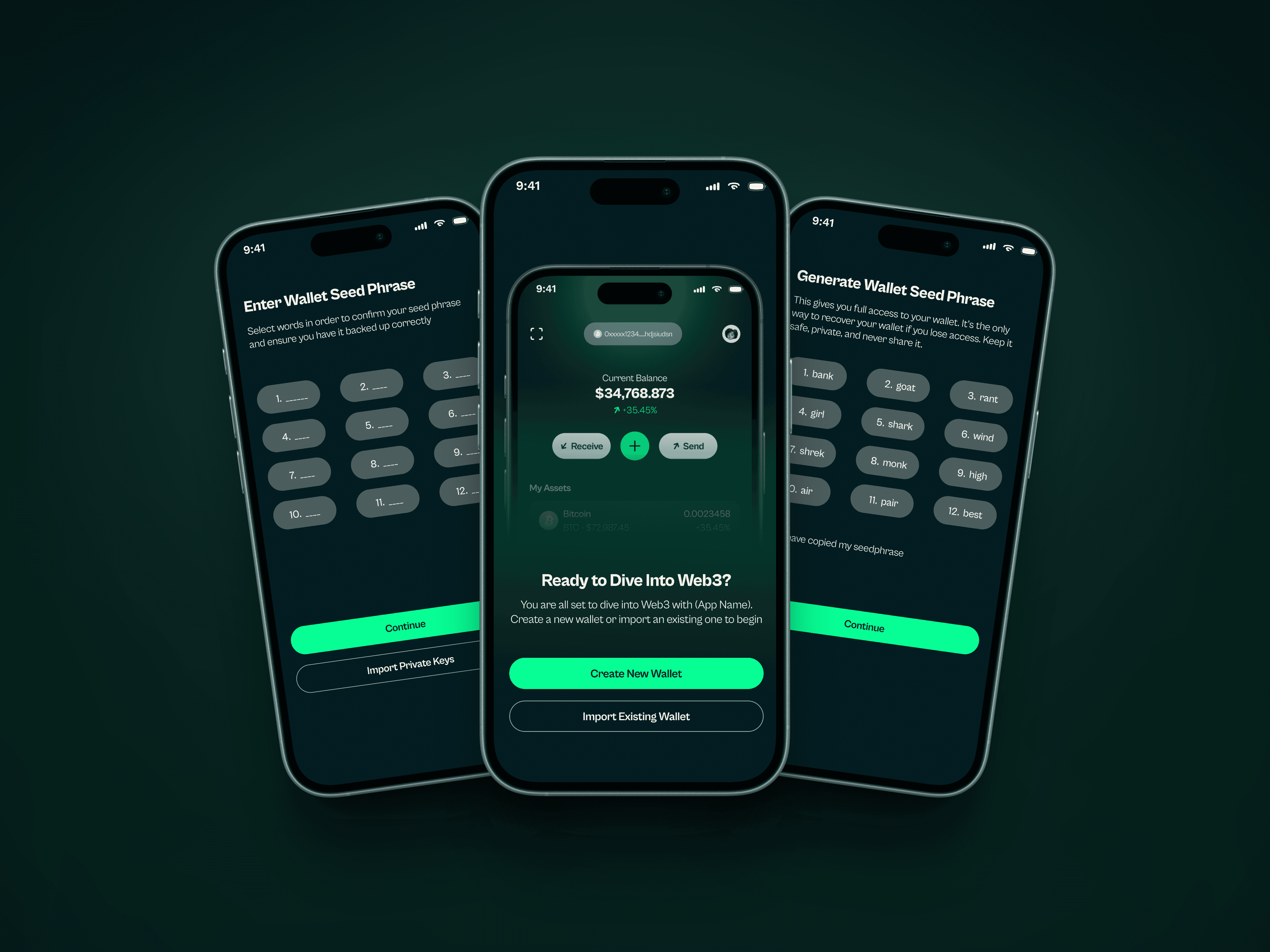
Bitex is a modern Web3 wallet built to simplify the way users interact with decentralized finance. Designed for both emerging crypto users and experienced traders, the product combines intuitive flows with a trustworthy visual language. My role was to lead the end-to-end interface design, transforming complex blockchain interactions into a clean, accessible, and conversion-ready experience.
Project Goal
The primary goal for Bitex was to design a Web3 wallet that didn’t just look secure—but felt instantly trustworthy to users from their very first interaction. We wanted to strip away the typical complexity of crypto platforms and offer a wallet that was simple, fast, and future-ready. My objective was to craft a product that onboarded users smoothly while still catering to more advanced Web3 use cases like bridging, swapping, and wallet integrations. Beyond functionality, we also aimed to establish a visual identity that could confidently stand beside the major players in the space—clean, credible, and flexible enough to support future product expansions.
Challenges
Even though Bitex was a fresh build, designing for the Web3 space comes with its own unique terrain. The first challenge was simplifying crypto jargon and interactions without compromising on clarity or control especially for actions involving high user stakes like asset transfers. Another major consideration was building immediate trust. Users are increasingly cautious of wallets and dApps due to scams, rug pulls, and UX dark patterns. It was critical that the product design communicate transparency and security at every step. Finally, there was the challenge of designing in a fast-evolving category—where standards shift often, and user expectations are anything but static. The design had to be both rigidly intuitive and fluid enough to adapt.
My Approach
For Bitex, I leaned hard into a futuristic, high-trust aesthetic. Inspired by Web3 culture and financial dashboard minimalism, the UI uses a deep green-black canvas layered with neon accents to evoke a sense of security and cutting-edge tech.
I prioritized clarity in high-stakes screens—like sending or receiving tokens—by using bold CTA buttons, simple form fields, and clear visual hierarchies. Network selection uses pill buttons with strong contrast, while TRON and ERC/BEP standards are front and center for fast recognition.
Microinteractions and iconography follow a sleek, almost sci-fi style, helping users feel like they’re operating inside a smart system, not a confusing crypto maze. The result? A UI that feels elite but not intimidating, ready for both degens and newbies.
Results
Although Bitex has not yet launched publicly, the design work laid a strong foundation internally.
Stakeholders adopted the design system across multiple upcoming products, validating its scalability
Usability testing sessions showed a marked reduction in confusion, especially around complex flows
Investors and partners responded positively to the brand’s visual identity, noting its clarity and polish
Most importantly, the project helped position Bitex as a credible player in a high-trust product category


