/
ThriftPay
ThriftPay: A Fintech Wallet with Landing Page
Role
UX/UI Designer
Timeline
2 Wochen
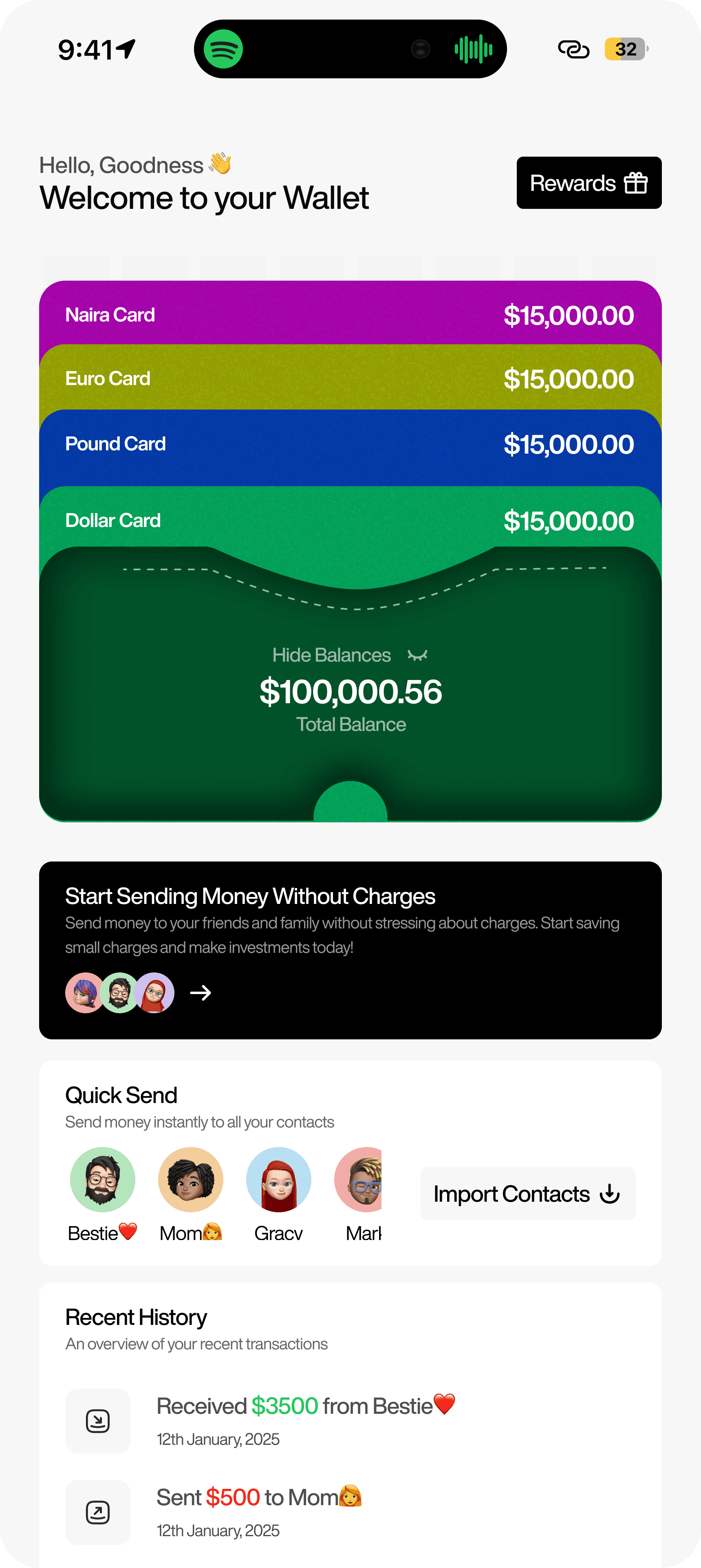
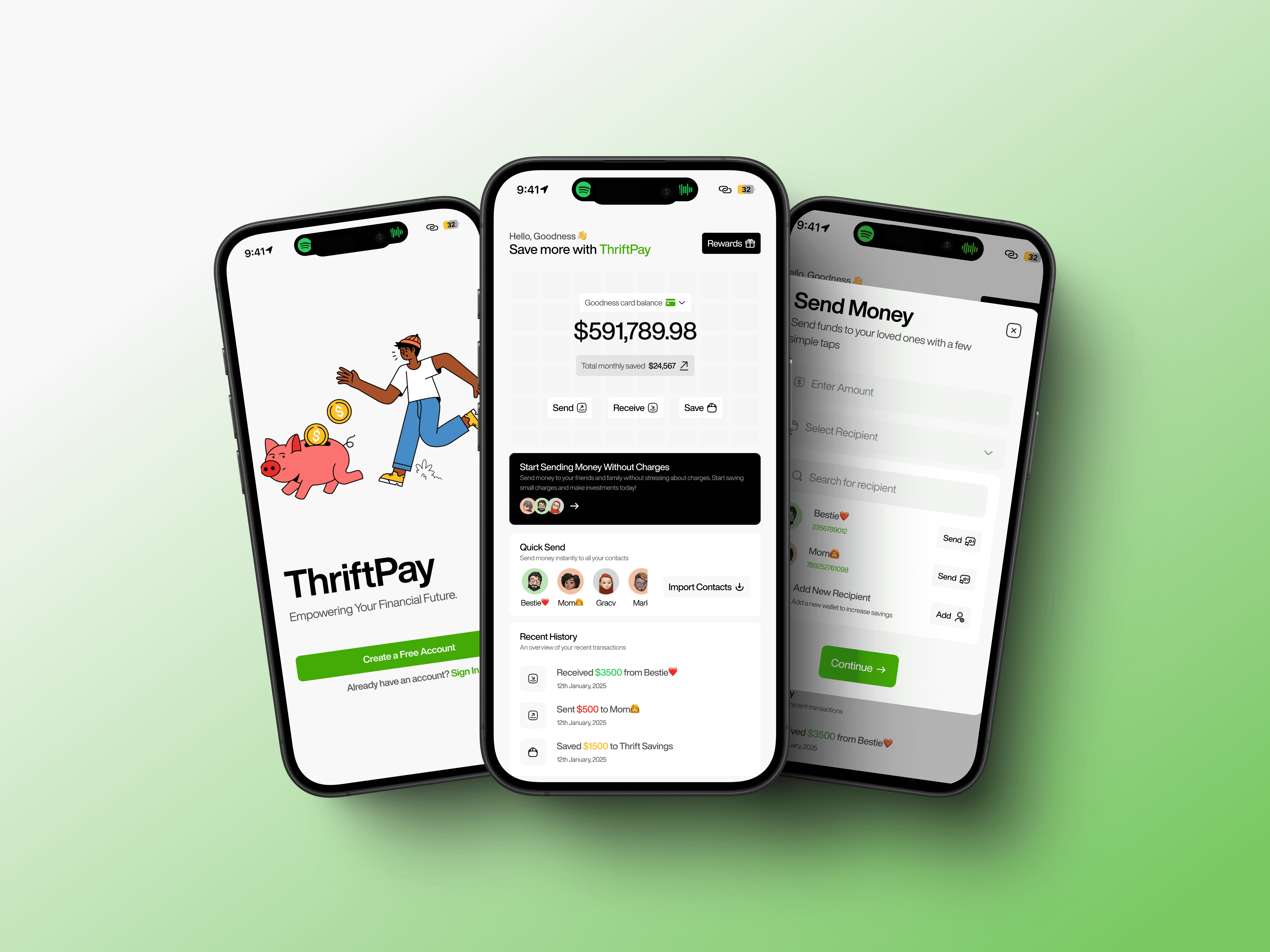
ThriftPay is a fintech wallet designed to make money management feel light, fast, and human. It empowers users to send and receive funds from their contacts and save instantly—with zero friction and 100% security. I designed the mobile app flow and crafted a sleek landing page, both built entirely in Framer, as part of a personal portfolio project.
Project Goal
The mission for ThriftPay was twofold:
Reimagine how Gen Z and young adults handle small-money transactions. The goal was to strip away unnecessary complexity and create a wallet experience that felt almost conversational—like sending a text, but with money.
Build emotional trust into every touchpoint. From onboarding to savings, the goal was to ensure users always felt safe, in control, and informed—even while interacting with the simplest features.
On the web side, I wanted the landing page to feel like a soft pitch deck—clear benefits, quick scannability, and a smooth flow that invited curiosity without overwhelming the visitor.
Challenges
Working without a real product meant wearing many hats: product thinker, content strategist, interaction designer, and brand storyteller. I had no data, no constraints, no real-world users—just the problem space. And that freedom is both a blessing and a creative block.
The hardest challenge was ensuring the design felt real, not theoretical. It had to look and behave like something that could launch tomorrow. I had to think critically about:
What problems are users actually facing with current wallets?
How do I design trust when I don’t have a company, legal fine print, or testimonials?
How do I balance aesthetic minimalism with financial credibility?
The visual style also needed to signal security, without leaning into the outdated “fintech = navy blue” trap. That required a lot of color testing, typography decisions, and interaction detailing to strike the right emotional tone.
Mein Ansatz
I kicked things off by defining three core user actions:
→ Add contacts
→ Send/receive funds
→ Save in one click
From there, I sketched out the user flows, keeping everything intentionally short and frictionless. I avoided multi-screen confirmations and instead used subtle design cues—like microcopy and animated icons—to reassure users at each step.
For the mobile app, I focused on edge-to-edge simplicity, large tap areas, and soft gradients that felt native on both light and dark mode phones. Typography played a big role too—clean, modern sans-serifs that were legible but also had personality.
Then came the landing page. Built in Framer, I structured it like a progressive reveal: first the big promise, then core features, followed by a visual walkthrough of how the product works. Motion was kept purposeful—used to guide attention, not just for flair.
Every section was written in plain English. No fintech jargon. No "disrupting the industry" fluff. Just a relatable tone that sounded like someone who understands how everyday people move money.
Results
بينما لم تطلق ThriftPay كمنتج، إلا أنها نجحت في تحقيق هدفها الحقيقي: عرض قدرتي على التفكير كمصمم منتجات، وليس مجرد فنان بصري.
النتيجة النهائية:
نموذج أولي لتطبيق موبايل يستجيب بالكامل مع تدفقات رئيسية
صفحة هبوط تم بناؤها باستخدام Framer يمكن أن تُطلق مع تغييرات طفيفة
نظام تصميم جاهز للتوسع إلى منتج حقيقي
تعليقات إيجابية من مصممين كبار وعملاء الذين قدّروا الوضوح، واللمعان، والتفكير الجاهز للمنتج
الآن تعتبر واحدة من أقوى مغناطيسات التحويل في محفظتي—مظهرة قدرتي على دمج حدس المنتج، وسرد القصص، والتنفيذ في تجربة سلسة واحدة.