/
PengFever
PengFever: Web3 Tap to Earn
Role
UX/UI Designer
Timeline
2 Weeks
A tap-to-earn Web3 game with crypto rewards and community buzz.
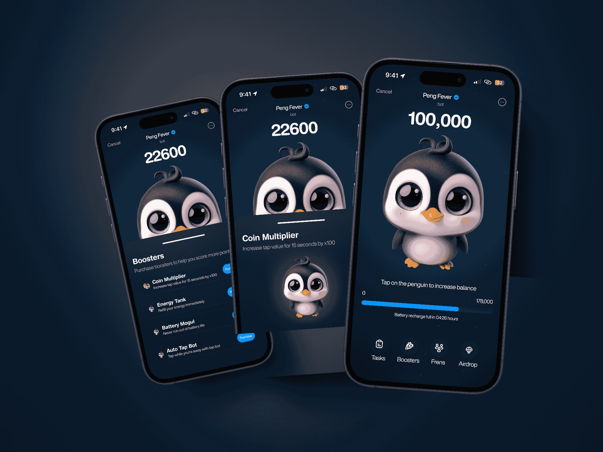
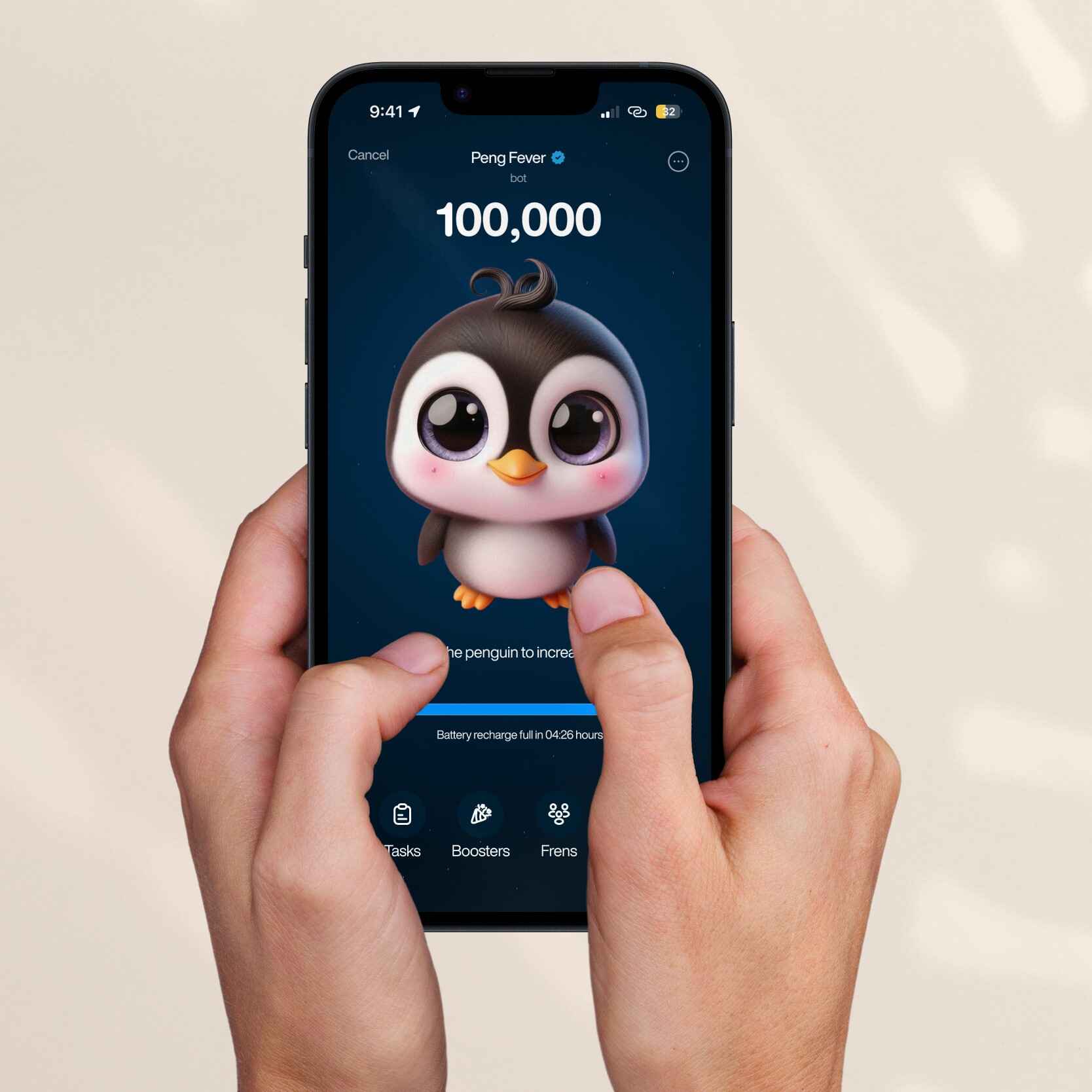
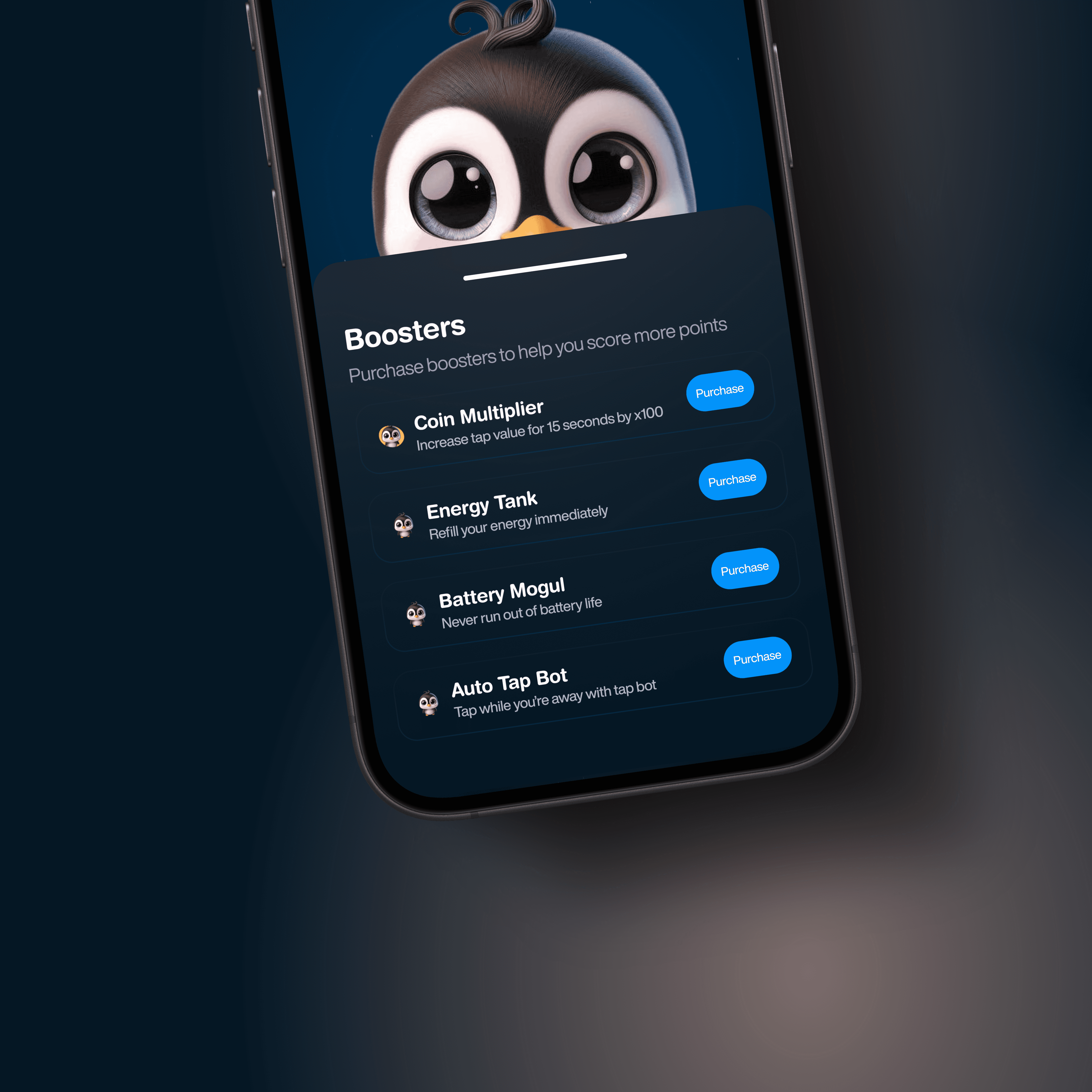
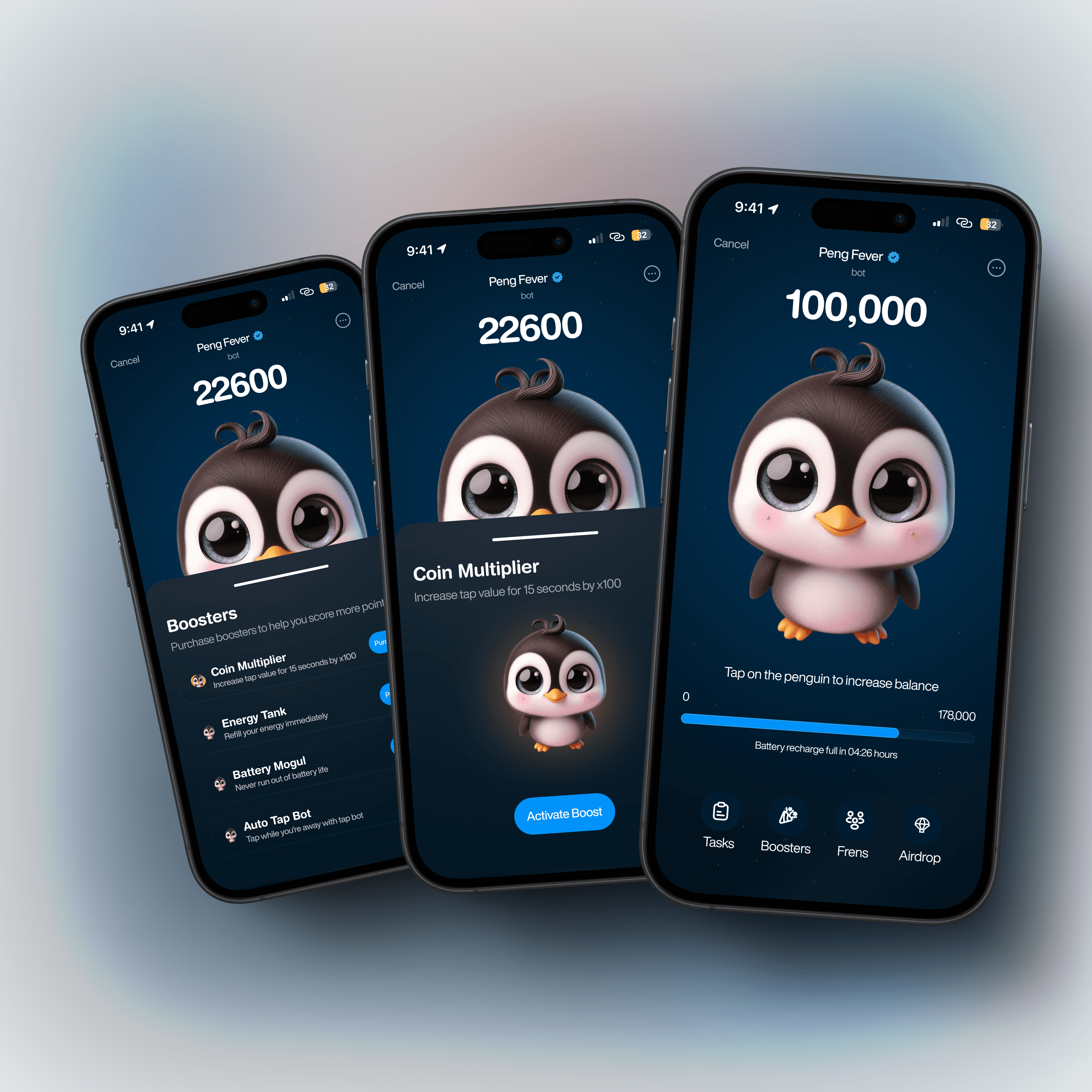
PengFever is a gamified airdrop experience where users earn points by tapping, convert them to tokens, invite friends via links, and buy boosters to multiply rewards. I was responsible for the full UI/UX design of the platform, bringing clarity to the chaos that Web3 interfaces often create.
Project Goal
The project required a UI that felt fast, responsive, and visually bold—especially for mobile users who were the core audience. A strong identity was crucial to standing out in a sea of airdrop-based platforms.
Challenges
Web3 is noisy. Tapping for tokens is new. The learning curve is steep.
Most users weren’t familiar with how to earn tokens by “tapping,” and many were skeptical of crypto platforms altogether. We had to design something that earned trust instantly while still bringing that dopamine-heavy game feel. The brand also needed to visually align with a crypto-savvy audience while being minimal enough for casual users.
My Approach
PengFever needed to feel like a game, not just look like one.
I started with a creative direction built around a galactic, Web3 aesthetic—rich blue hues, neon accents, and sparkly UI highlights that echoed the thrill of crypto earning. But under the glam was structure. Every interaction, from the tap mechanic to the wallet overview, was designed for clarity and speed.
I simplified token logic into bite-sized UI elements. Instead of overwhelming charts or obscure data, I used badges, point counters, and animated transitions to create feedback loops that kept users engaged. Tap buttons were spaced for thumbs. Reward states had celebratory animations. I also created a modular system that made it easy to scale the interface for future reward systems, booster add-ons, and referral bonuses.
To build trust with new users, I limited cognitive overload by keeping the interface clean and focused—using color and motion only where it added meaning. This helped balance the excitement of the gamified experience with the need for Web3 legitimacy.
Results
The design served as a catalyst for clarity and internal buy-in.
The final prototype didn’t just visualize a product—it sold the vision. Stakeholders quickly aligned on the flow and structure after walking through the UI, with several expressing how the design made the product feel tangible for the first time. The visual direction became a reference point for content strategy, marketing comms, and token logic.
The interface also sped up decision-making across the board cutting down developer questions and helping the team prioritize what to build for an MVP launch window.